VA SAIL metrics are a way of summarizing VA hospital performance data. Individual data sets by location are available for download from VA.gov. These are excel files formatted with banners and special characters that produce a large amount of dirtiness when the data are imported into R:
file <- curl::curl_download("https://www.va.gov/QUALITYOFCARE/SAIL_FY19_Q1/SAIL-2_albany_fy19q1.xlsx",
                            destfile = tempfile())

data_dirty <- suppressMessages(readxl::read_excel(file))

dplyr::glimpse(data_dirty)
#> Observations: 102
#> Variables: 18
#> $ ...1                                                      <chr> NA, NA, N...
#> $ ...2                                                      <lgl> NA, NA, N...
#> $ ...3                                                      <lgl> NA, NA, N...
#> $ ...4                                                      <lgl> NA, NA, N...
#> $ ...5                                                      <lgl> NA, NA, N...
#> $ ...6                                                      <lgl> NA, NA, N...
#> $ `Strategic Analytics for Improvement and Learning (SAIL)` <chr> NA, NA, N...
#> $ ...8                                                      <lgl> NA, NA, N...
#> $ ...9                                                      <lgl> NA, NA, N...
#> $ ...10                                                     <lgl> NA, NA, N...
#> $ ...11                                                     <chr> NA, NA, N...
#> $ ...12                                                     <chr> NA, NA, N...
#> $ ...13                                                     <lgl> NA, NA, N...
#> $ ...14                                                     <lgl> NA, NA, N...
#> $ ...15                                                     <chr> NA, NA, N...
#> $ ...16                                                     <chr> NA, NA, N...
#> $ ...17                                                     <lgl> NA, NA, N...
#> $ ...18                                                     <chr> NA, NA, N...
sail_tidy
To make these data easier to handle in R, sail_tidy will download, import, and wrangle the dataset into a clean data frame that’s easier to analyze in R.
library(tidyVA)
library(ggplot2)
library(dplyr)


albany_sail <- sail_tidy("https://www.va.gov/QUALITYOFCARE/SAIL_FY19_Q1/SAIL-2_albany_fy19q1.xlsx")

glimpse(albany_sail)
#> Observations: 62
#> Variables: 8
#> $ label               <chr> "Acute care Standardized Mortality Ratio (SMR)"...
#> $ measure_unit        <chr> "O/E", "O/E", "%", "%", "%", "%", "%", "O/E", "...
#> $ preferred_direction <chr> "<U+2193>", "<U+2193>", "<U+2193>", "<U+2193>", "<U+2193>", "<U+2193>", "<U+2193>", "<U+2193>", "<U+2193>", "<U+2193>...
#> $ best_10_percent     <chr> "0.469", "0.740", "7.219", "5.676", "7.820", "4...
#> $ ntiles_10_50_90     <chr> "0.469 - 0.857 - 1.193", "0.740 - 0.952 - 1.178...
#> $ site                <chr> "Albany", "Albany", "Albany", "Albany", "Albany...
#> $ value               <chr> "0.898", "0.923", "8.191", "8.726", "7.667", "6...
#> $ measure             <chr> "AcuteCareStandardizedMortalityRatioSmr", "Acut...
Using map_df from the purrr package you can create a data frame of metrics from several sites:
albany <-  "https://www.va.gov/QUALITYOFCARE/SAIL_FY19_Q1/SAIL-2_albany_fy19q1.xlsx"
syracuse <- "https://www.va.gov/QUALITYOFCARE/SAIL_FY19_Q1/SAIL-2_syracuse_fy19q1.xlsx"
bath <- "https://www.va.gov/QUALITYOFCARE/SAIL_FY19_Q1/SAIL-2_bath_fy19q1.xlsx"
buffalo <- "https://www.va.gov/QUALITYOFCARE/SAIL_FY19_Q1/SAIL-2_buffalo_fy19q1.xlsx"
bronx <- "https://www.va.gov/QUALITYOFCARE/SAIL_FY19_Q1/SAIL-2_bronx_fy19q1.xlsx"

links <- c(albany, syracuse, bath,
           buffalo,bronx)

data <- purrr::map_df(links, sail_tidy)
This can then easily be explored within the tidyverse
data %>%
  distinct(measure)
#> # A tibble: 63 x 1
#>    measure
#>    <chr>
#>  1 AcuteCareStandardizedMortalityRatioSmr
#>  2 AcuteCare30DayStandardizedMortalityRatioSmr30
#>  3 AmiRsmr
#>  4 ChfRsmr
#>  5 PneumoniaRsmr
#>  6 CopdRsmr
#>  7 StrokeRsmr
#>  8 InHospitalComplications
#>  9 CatheterAssociatedUrinaryTractInfection
#> 10 CentralLineAssociatedBloodstreamInfection
#> # ... with 53 more rows
data %>%
  filter(measure =="AcuteCareStandardizedMortalityRatioSmr") %>%
  mutate(SMR = as.numeric(value)) %>%
  ggplot(aes(reorder(site, SMR), SMR)) +
  geom_point() +
  geom_segment(aes(x = site, y = 0,
                   xend = site, yend = SMR)) +
  coord_flip() +
  geom_hline(yintercept = 0.409, lty = "dashed", color = "darkred") +
  labs(x = NULL, y = "Standardized Ratio") +
  ggtitle("Acute Care Standardized Mortality Ratio (SMR)",
          subtitle = "VISN 2 - 2019 Q1") +
  theme_va(grid = FALSE)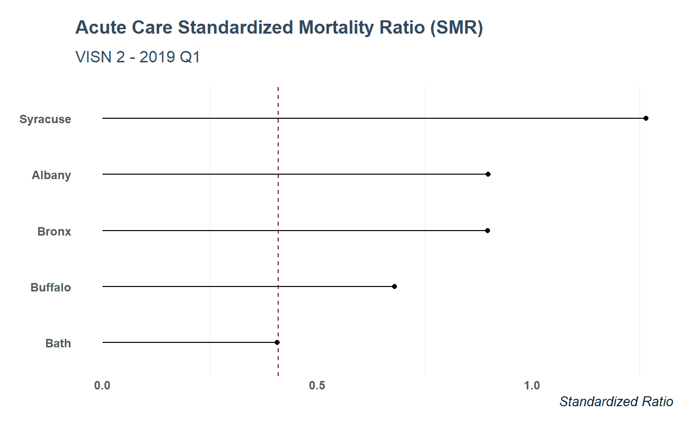
data %>%
  filter(measure == "PopulationCoverage") %>%
  mutate(value = as.numeric(value)) %>%
  arrange(desc(value)) %>%
  ggplot(aes(forcats::fct_inorder(site), value)) +
  geom_col(alpha = .75, fill = "#fdbf11", width = .75 ) +
  labs(y = "Standardized Score", x = "",
       color= "Site") +
  ggtitle("Population Coverage - Mental Health",
          subtitle = "SAIL Metrics for VISN 2") +
  theme_va(grid = "XY")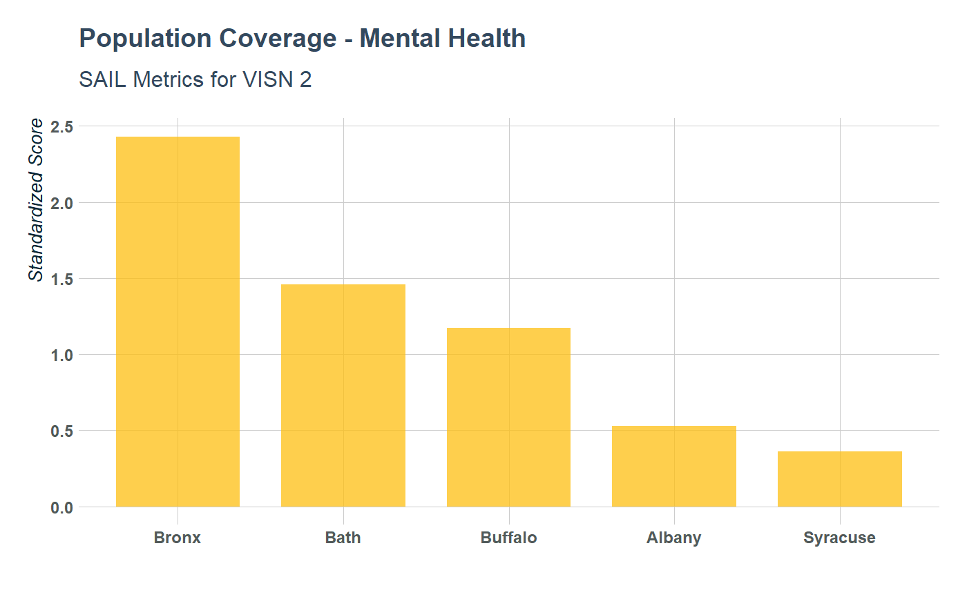
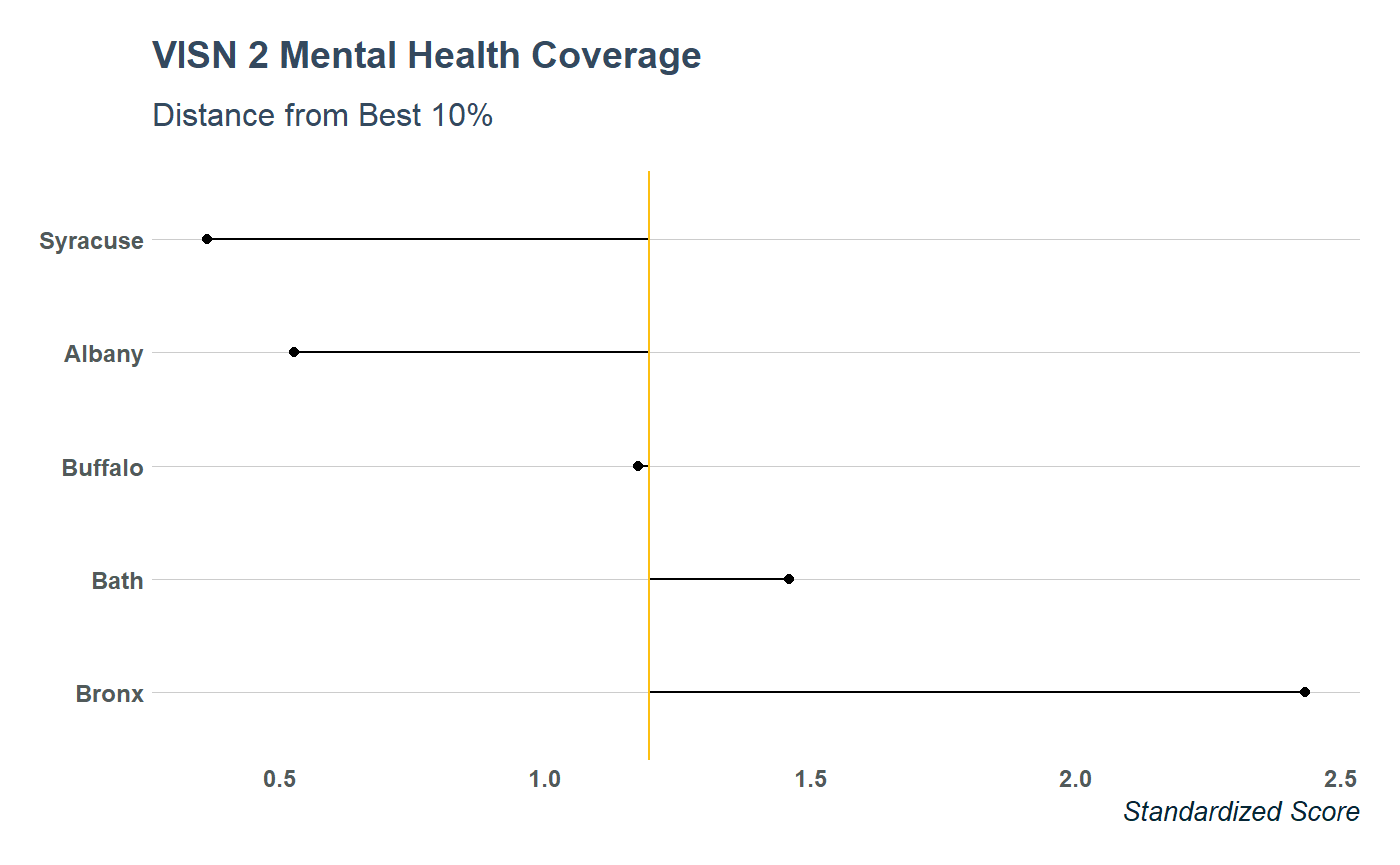
data %>%
  filter(measure == "PopulationCoverage") %>%
  mutate(value = as.numeric(value),
         best_10 = as.numeric(`best_10_percent`)) %>%
  arrange(desc(value)) %>%
  ggplot(aes(forcats::fct_inorder(site), value)) +
  geom_point() +
  geom_segment(aes(x = site, y = best_10,
                   xend = site, yend = value)) +
  coord_flip()  +
  geom_hline(aes(yintercept = best_10),
             lty = "solid", color = "#fdbf11") +
  labs(x = NULL, y = "Standardized Score") +
  ggtitle("VISN 2 Mental Health Coverage",
          subtitle = "Distance from Best 10%") +
  theme_va(grid = "Y")